Visual
identity

A steady investment in visual identity is rewarded by lasting competitiveness.
The Objective
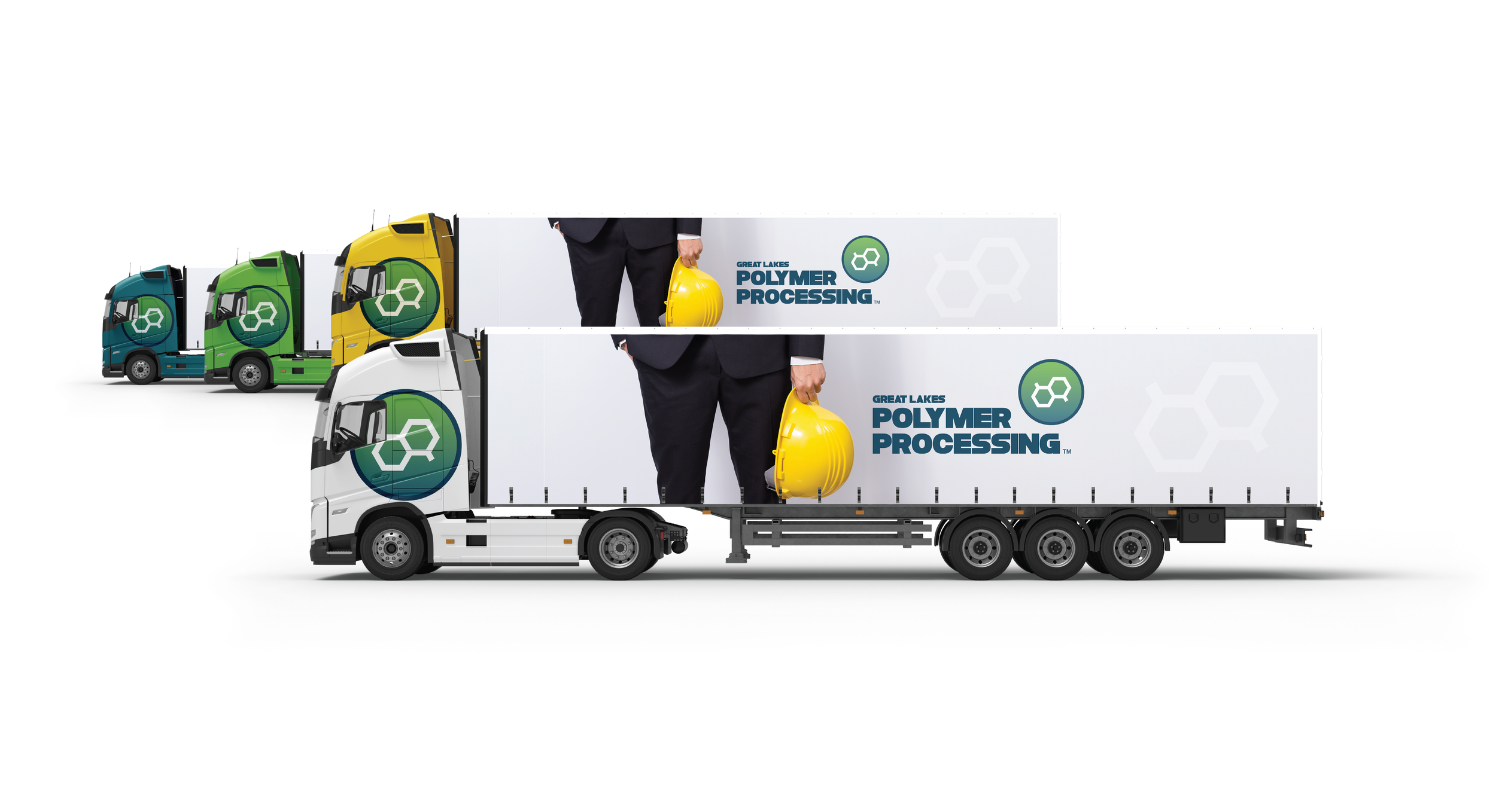
Great Lakes Polymer Processing wanted a dynamic, consistent visual identity that embodied and advanced the company's brand by supporting a desired perception that could become intrinsic to the organization's culture, core values, and company heritage. We delivered a compelling visual identity that would be immediately recognizable, offering a distinctive professional image to investors and positioning the company's launch for success.
A matter
of science
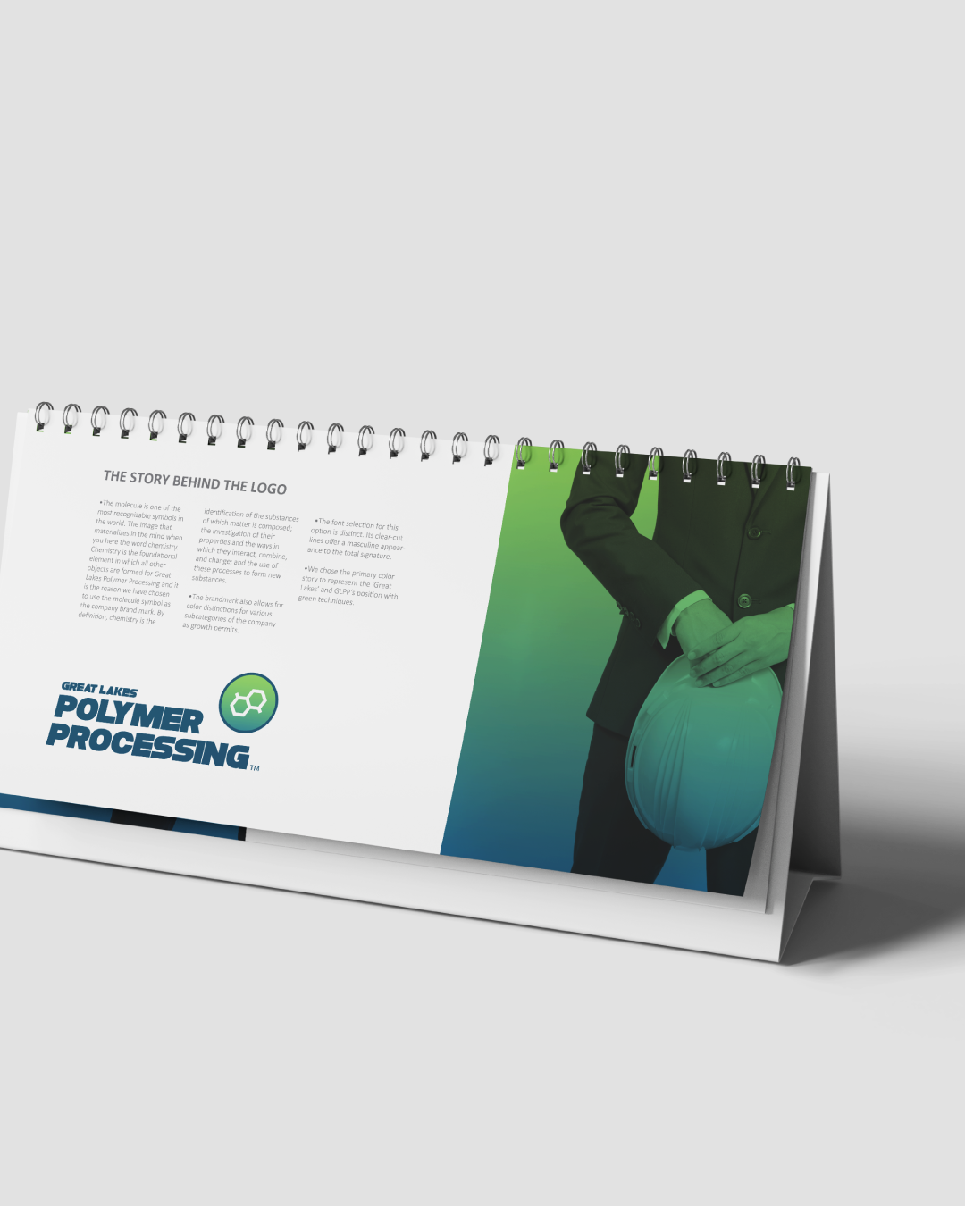
The molecule is one of the most recognizable symbols in the world. When you hear the word chemistry, the image of the molecule materializes in the mind.
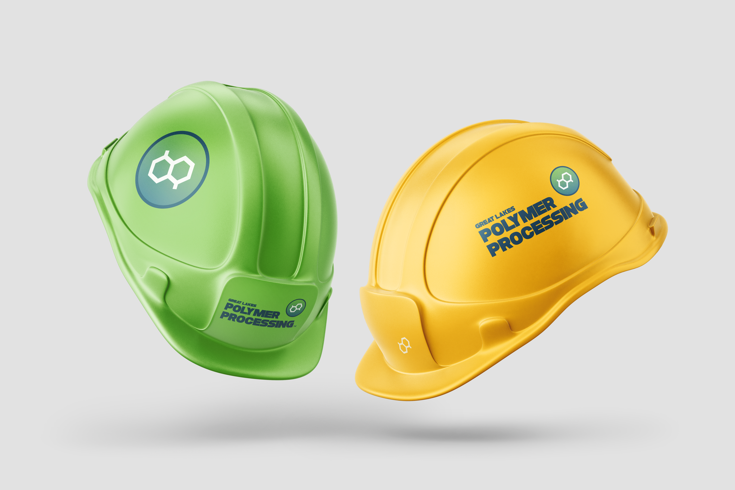
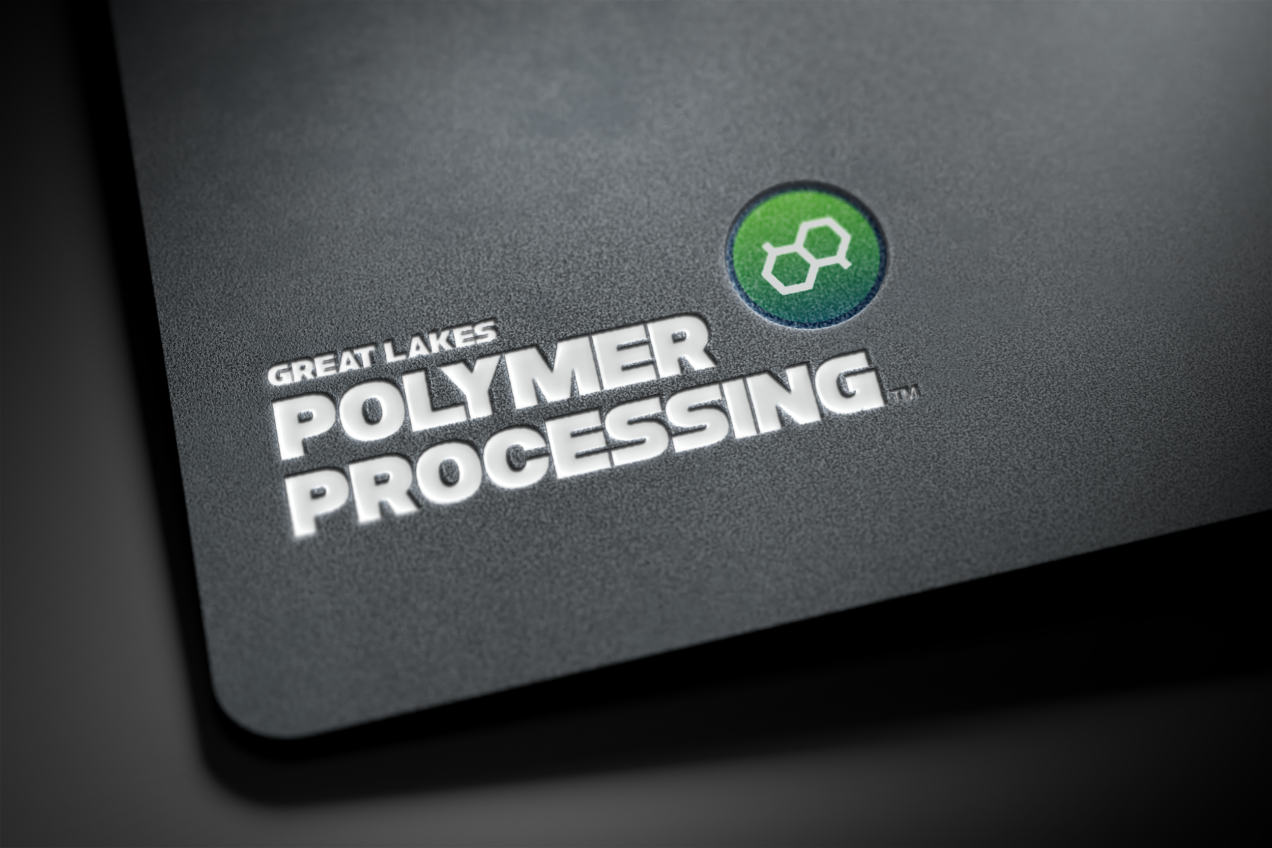
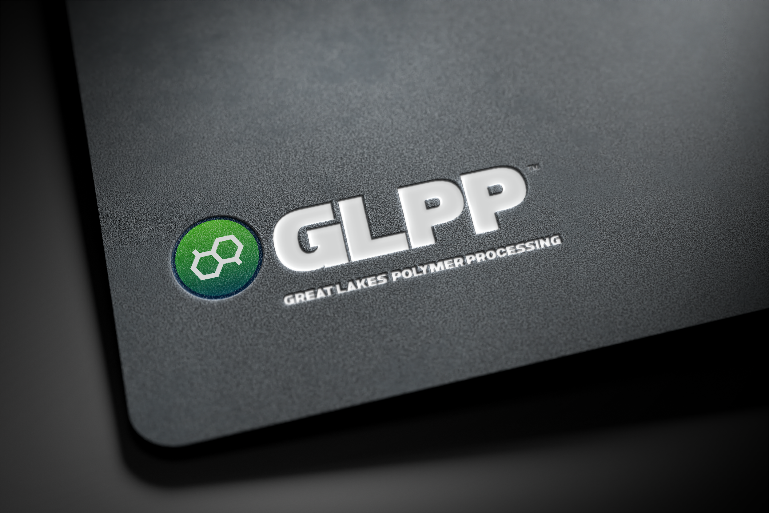
The science of matter (chemistry) is the foundation on which all products are manufactured for Great Lakes Polymer Processing. Thus, the molecule symbol was chosen as the company brand mark. By definition, chemistry is the identification of the substances of which matter is composed, the investigation of their properties, and the study of how they interact, combine, and change to form new substances; a 100% recycled rubber compound (patent pending).
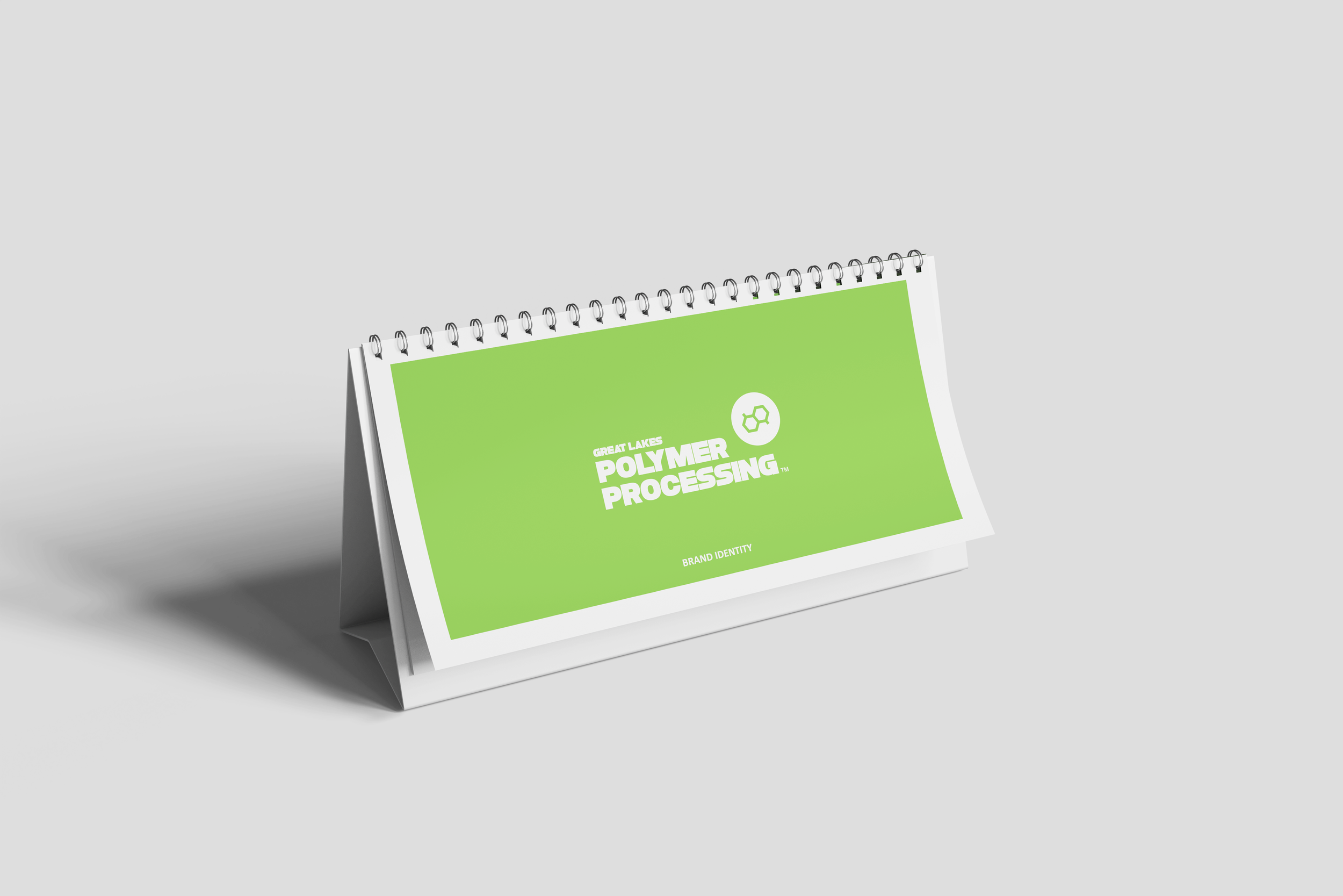
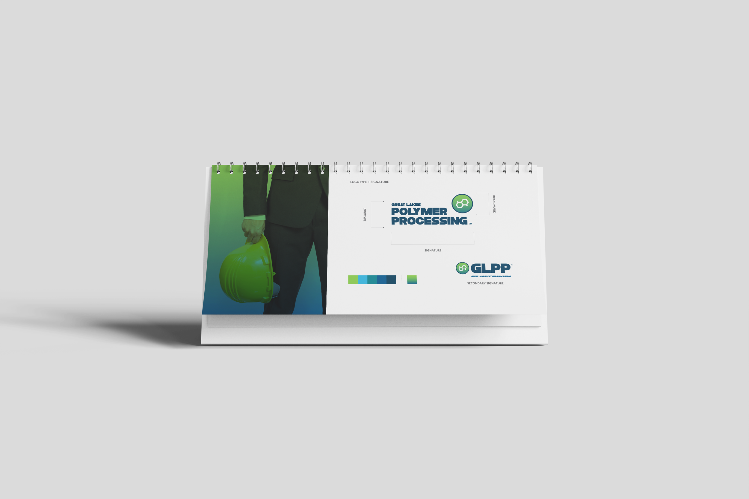
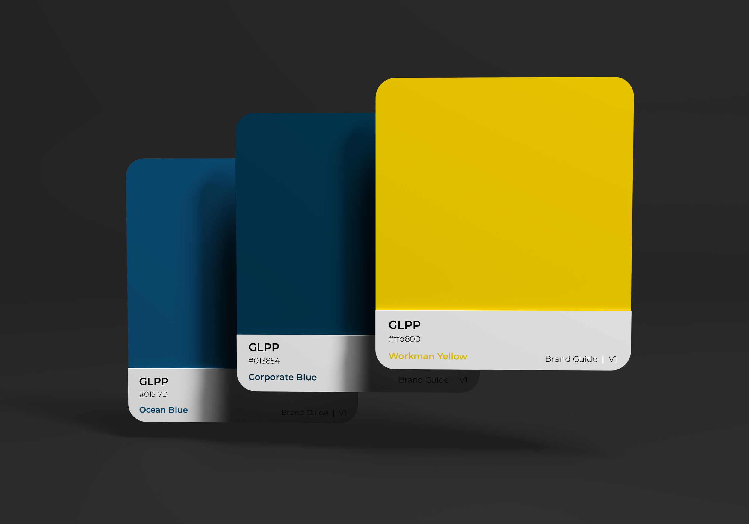
“We consider our brand (our reputation) to be one of the most valuable company assets.”
A quiet technical
confidence

-
Ground the work in Strategy
-
Establish Visual Principles
-
Explore Visual Directions
-
Design the Core Elements
-
Expand into a Flexible System
-
Apply and Stress-Test
-
Codify the Identity
-
Refine and Socialize
- Ground the work in Strategy - Establish Visual Principles - Explore Visual Directions - Design the Core Elements - Expand into a Flexible System - Apply and Stress-Test - Codify the Identity - Refine and Socialize
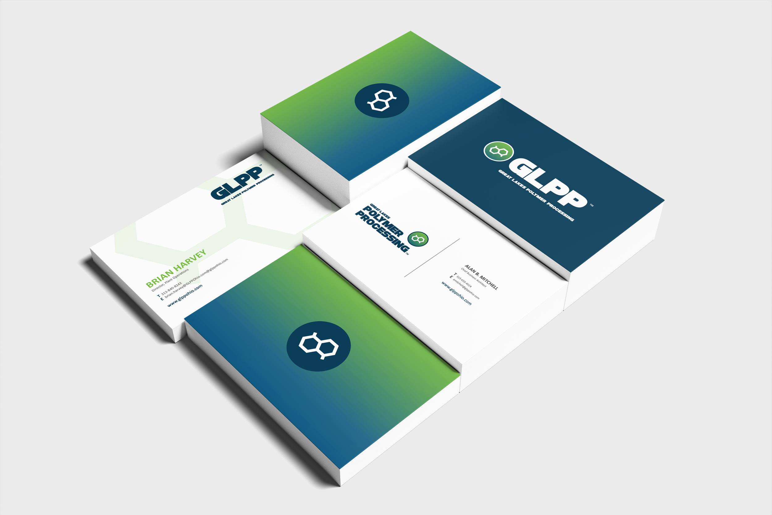
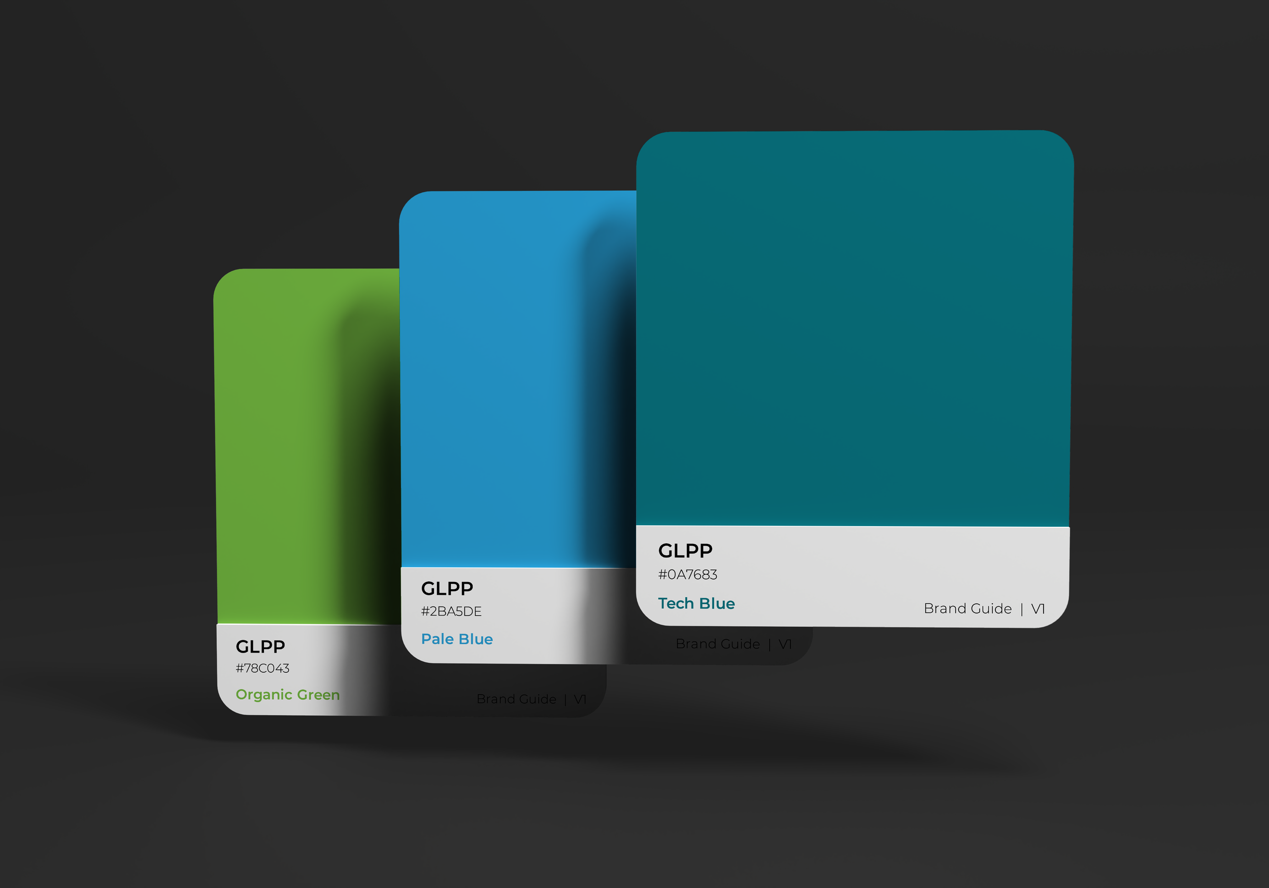
Building on a clear understanding of Great Lakes Polymer Processing’s industrial expertise and customer expectations, we developed a visual identity that expresses precision, strength, and quiet technical confidence. We established guiding visual principles, explored creative directions, and built a cohesive system around logo, color, typography, and imagery that feels modern, credible, and distinctly industrial—without relying on generic manufacturing clichés. The result is a flexible visual language that reinforces the company’s reputation for innovative polymer solutions while remaining practical and consistent across technical documents, digital platforms, and customer-facing materials.